Branding Case Study
CUTTING TO THE CHASE
Tanto manufactures precision botany tools. Their flagship product is the T1 trimmer. Tanto was originally branded “Botanex” before Tanto’s co-founder, Lukas, approached me. He wanted to transform his hardware company into a lifestyle brand.

︎︎
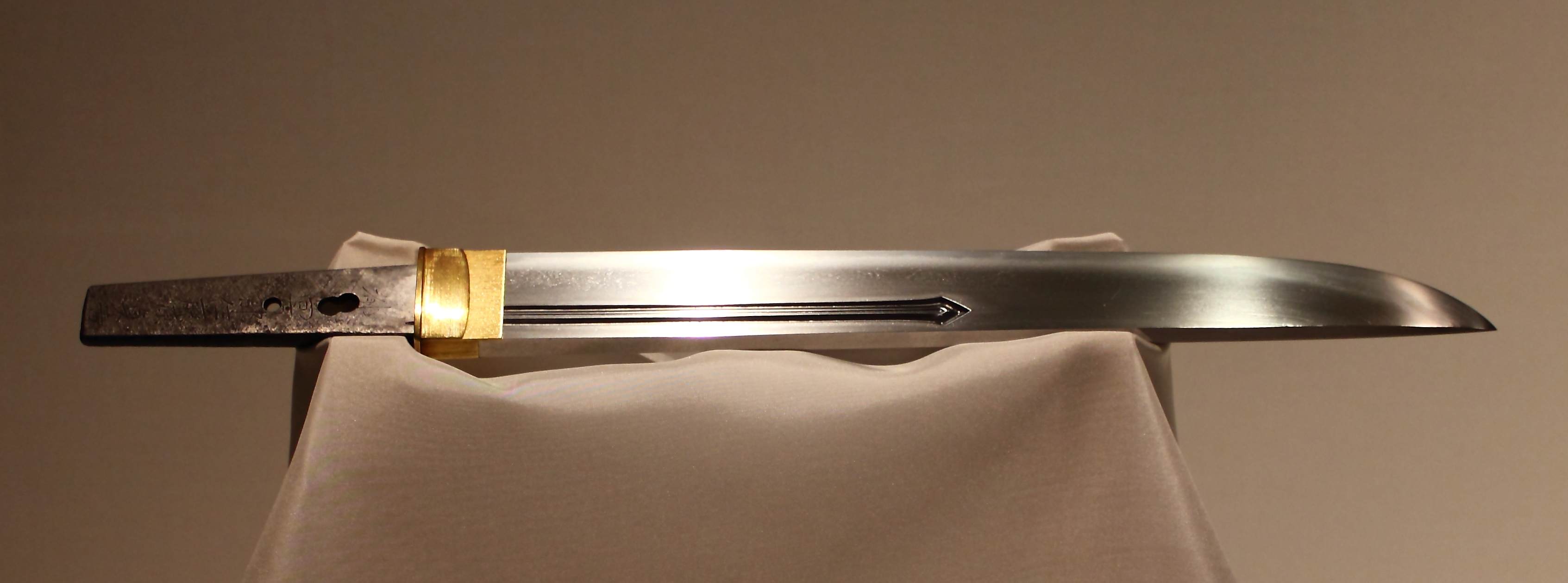
Influenced by the discipline, humility, and beauty that surrounded the art of bonzai, I delved into pre-modern Japanese culture in search of a word or object that would communicate those same values. Having studied traditional Japanese martial arts for 14 years, I turned to the samurai. Warriors of honor and integrity, samurai would carry and fight with bladed weapons called katana. I recalled they also wielded a short sword. A quick search revealed that the blade was called the tantō.

With a name selected, it was time to flesh out the feel of of the brand beginning with Tanto’s typeface. I chose Gotham for its robust and balanced lettering. My intention was to create a brand of hardware that would feel reliable 200 years into the future, much like a Stanley thermos. With the typeface selected, I turned towards the “lifestyle” aspect of Tanto.
What world did Tanto exist within?
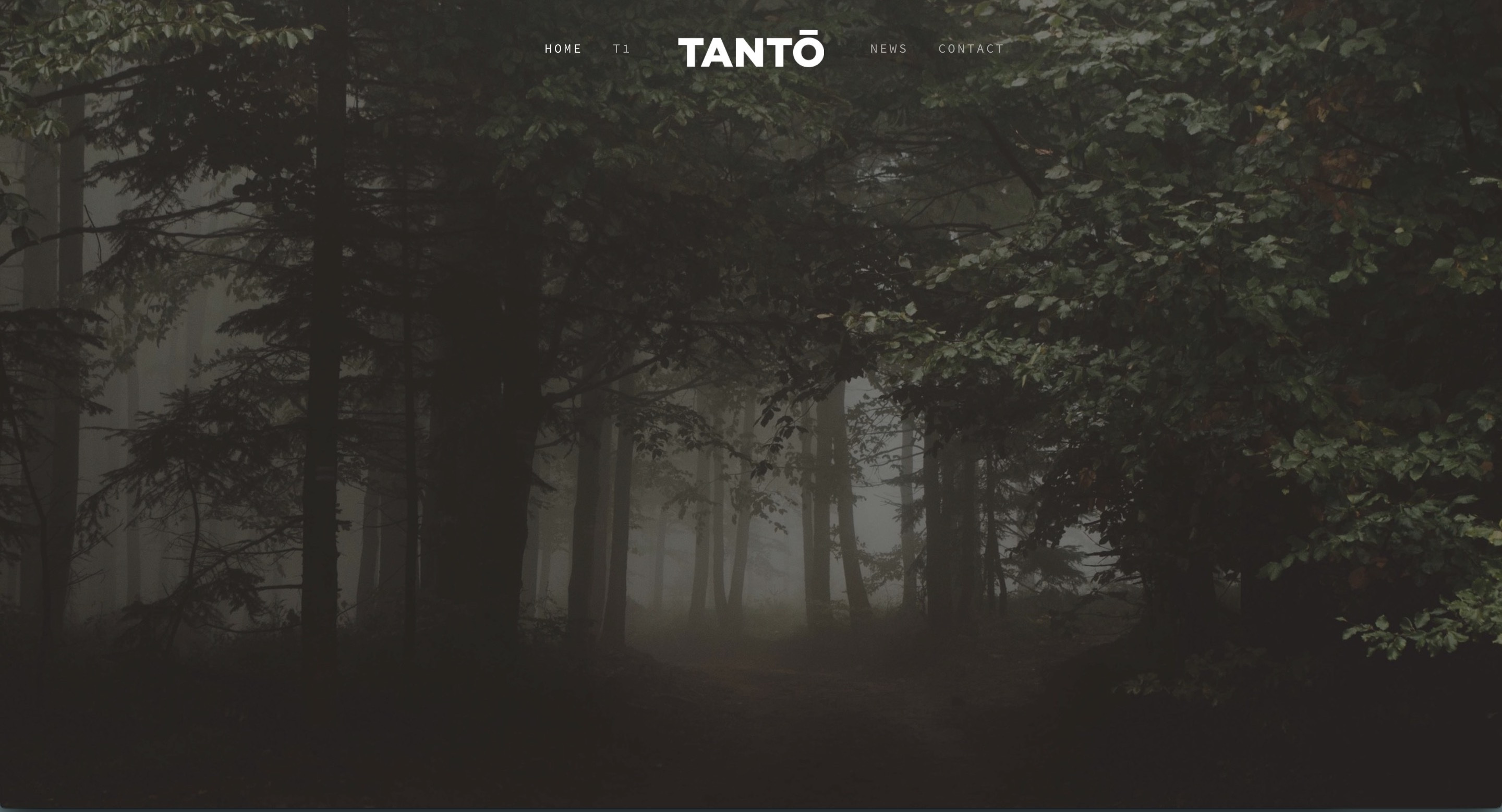
Having hiked Yosemite recently, my mind was filled with forestry. The visuals of a foggy forest evoke a darkness and mystery that leave room for interpretation, for the projection of our own emotions. A space for our own thoughts that was equal parts natural and intimate. I quickly found gorgeous, royalty-free forest imagery and super imposed Tanto’s newly created branding on it, creating the environment I wanted to transport people to when they held a Tanto tool in their hands.