Branding Case Study
BRINGING GAMES TO LIFE
Eucl3D provided game developers with 3D-printing software, allowing their customers to order models of game characters and environments right from their couches.
Crafting the Eucl3d brand identity was one of my first tasks as their lead designer. I sat with co-founders Brian and Jesse for two hours, asking them to describe how they wanted Eucl3d to feel.
Original Eucl3d Logo

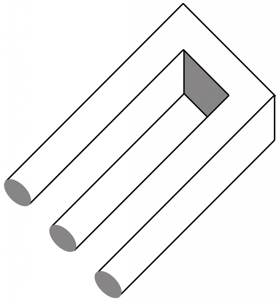
Devil’s Fork
Brian was drawn to M.C. Escher’s geometrical, optical illusions. Jesse wanted to communicate a level of professionalism expected from a high-end studio. Both wanted a brand that would scale with the company.
Following Brian’s cue, I sought inspiration from impossible shapes. The “devil’s fork” illusion bore an uncanny resemblance to the letter “E”. The way it tricked the eye, alternating between two and three dimensions, felt conceptually appropriate for a company that brought objects from 2D screens into the real world.
Following Brian’s cue, I sought inspiration from impossible shapes. The “devil’s fork” illusion bore an uncanny resemblance to the letter “E”. The way it tricked the eye, alternating between two and three dimensions, felt conceptually appropriate for a company that brought objects from 2D screens into the real world.
I set out to simplify the Eucl3d brand so that it was cleaner and more memorable, sticking with simple, clean lines in an effort to avoid overshadowing the unique personality of the various games Eucl3d would partner with as the company grew.
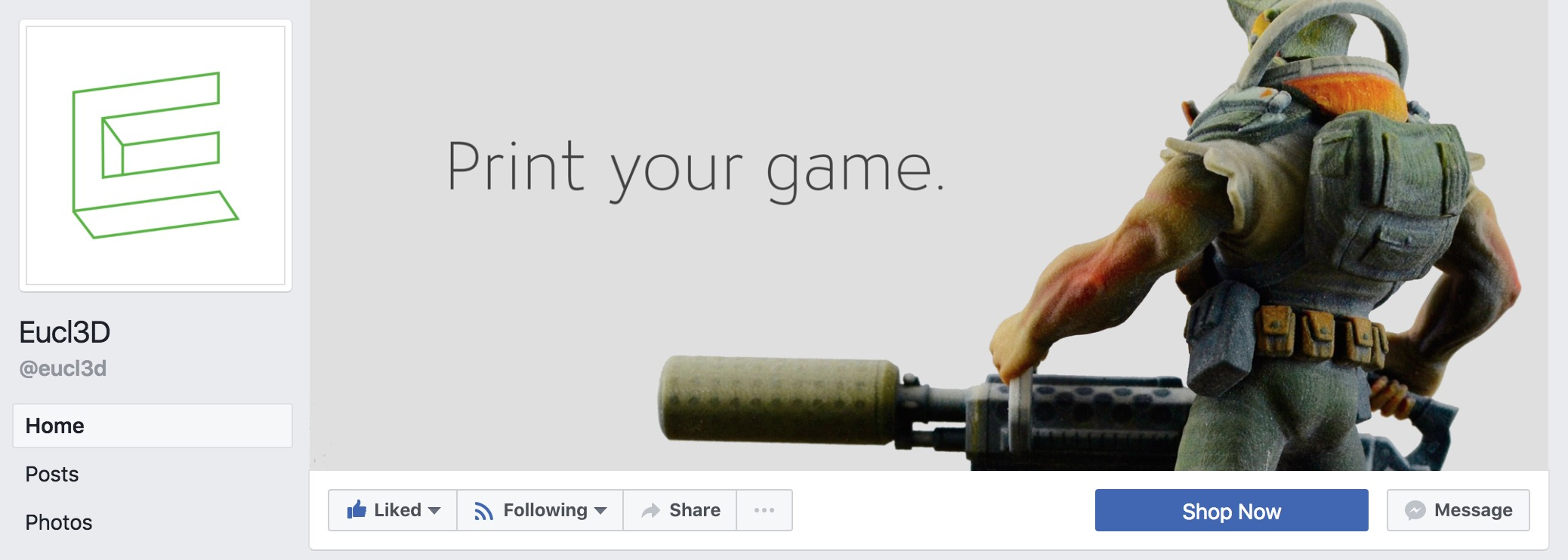
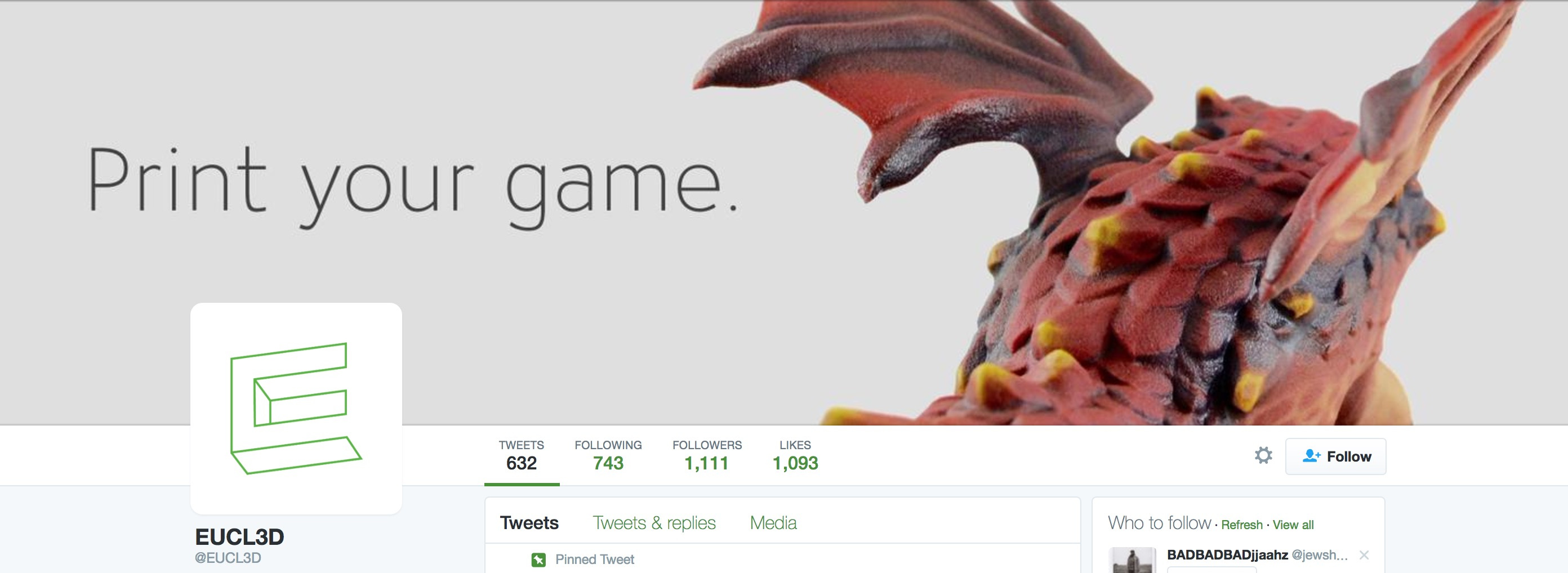
The logo itself plays with the eye, but sits quiety in the background when put to use. Attention is drawn to the highly-detailed models Eucl3d produces for its clients, simultaneously building brand familiarity and immediately communicating Eucl3d’s product offering and value to both potential clients and customers.
The logo itself plays with the eye, but sits quiety in the background when put to use. Attention is drawn to the highly-detailed models Eucl3d produces for its clients, simultaneously building brand familiarity and immediately communicating Eucl3d’s product offering and value to both potential clients and customers.

Finalized Logo


Photography & Design by George Syrop
